
Modern Website Design Trends for 2025
While the phrase “modern website design” might seem straightforward to seasoned web professionals, it's a lot more than just pictures, colors, and buttons on a page. Its nuances profoundly shape user expectations, brand perception, and a site’s long-term viability. In fact, web design is responsible for 94% of a visitor’s first impression of your clients’ businesses.
In this article, we’ll take a forward-looking approach to 2025’s most important design trends.
White space, negative space and minimalism
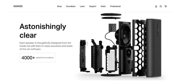
Source: Sonos
"Less is more." Although lots of designers are going maximalist with their text content, there's still a big trend towards minimalism and the use of white space. In fact, that's how they make their maximalist text pop.
White space (or negative space) refers to the empty or unmarked area of a design, and it's as important as the elements on the page. It helps to create balance, contrast, and visual hierarchy. It also reduces cognitive load and makes the important elements on the page stand out.
Minimalism is also a way to reinforce your clients’ branding. If the product already prioritizes sleek design, minimalist packaging, a luxurious feel, and easy-to-use features, reflecting that in the website design is an absolute MUST!
Mobile first, responsive design
Google's mobile-first indexing requirements mean search engine crawlers will prioritize the mobile version of your website content, rather than the desktop version. And, in January 2024, mobile site visits (excluding tablets) accounted for more than 60% of all web traffic.
This makes responsive design among the most important considerations for modern website design. It guarantees the website can be easily viewed and navigated on any device, from smartphones to tablets and desktop computers.
The mobile version of the site should have:
- The hero, main copy, and CTA before scrolling
- Bigger font sizes and clickable icons, buttons, and links for touchscreen usage
- No horizontal scrolling — text and images should fit within the screen width
- Simple, app-like navigation that's suited for touchscreen usage
QuickPro Mobile's approach puts responsiveness at the forefront.
Best for: ALL websites — this is a basic requirement for modern website design, and all your clients should have a responsive website to ensure optimal user experience and search engine ranking.
Hi-res and big images
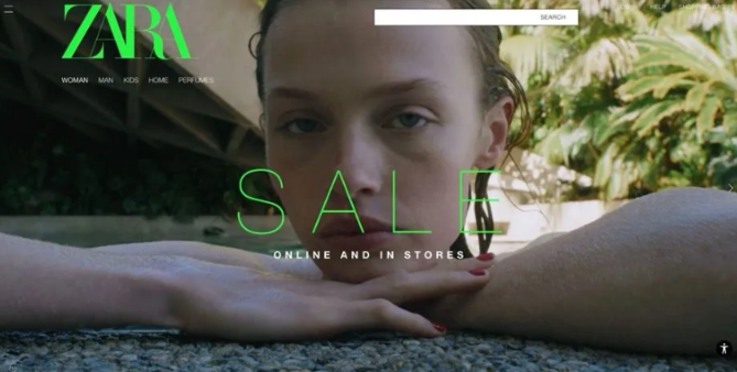
Source: Zara
All over, we're seeing images take the forefront on websites. High-quality, large images can grab attention and give a visual break to text-heavy pages.
You can use images to:
- Showcase a product you want to highlight
- Convey a certain type of "vibe" or emotion that aligns with your client’s brand or website
- Break up text-heavy pages and make content more digestible
Maximalist typography
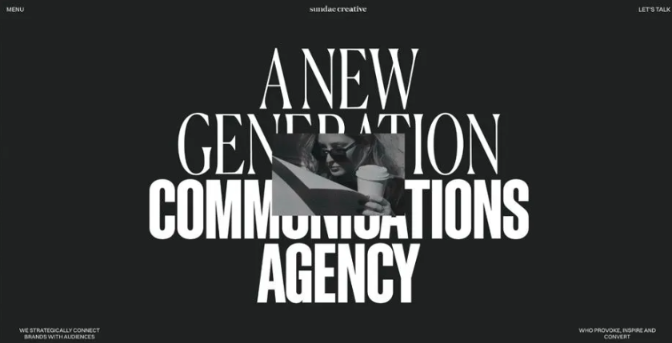
Source: Sundae Creative
They say, "A picture is worth a thousand words." With maximalist typography, where large, layered text is used to make a bold visual statement, the words are part of the picture. In fact, they're the focal point.
- Expressive fonts bring out the personality of a brand and convey its message (and they're attention-grabbing).
- Layering different fonts within images adds depth to a design, making it more visually interesting.
- Bold titles establish a clear visual hierarchy, making the rest of the site’s content easy to scroll.
- Best of all, they can actually simplify the web design process (since the text replaces at least some complex images or illustrations).
Keep in mind that if you're going to go this route, you need to use high-contrast colors and font pairings for maximum impact.
Playful and interactive websites
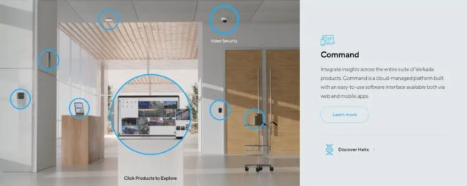
Source: Verkada
One of our favorite trends over the last year has been the increasing use of website animations and interactive design elements.
- Parallax scrolling, where the background of a website moves slower than the foreground creates a 3D effect.
- Interactive menus and buttons that change color or shape when hovered over.
- Microinteractions, like small animations or sounds that respond to user actions (e.g., a loading animation, a progress completion bar, a click animation).
- Loading animations that include progress, fun facts, or a playful image to entertain users while they wait.
You can use these to make the site experience more engaging, which is especially important in the case of an interactive loading screen. Users will abandon a website that takes longer than three seconds to load, but the issue could be with their WiFi connection or a slow server, not your client’s site. By keeping their site visitors entertained, you can use this to reduce their bounce rate.
For instance, Expedia shows a plane flying through clouds, and updates visitors on what the site is doing in the background (in this case, searching through flights in their database).
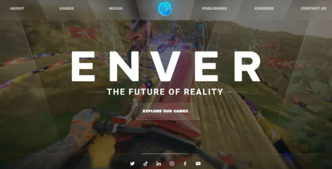
Source: Enver Studio
You can also use interactivity to demo a product or help customers get to know it right from the home screen. VR Game Developer Enver Studio uses their home page to show users what it's like to play their popular game, MotoX.
Bold, bright and vibrant colors
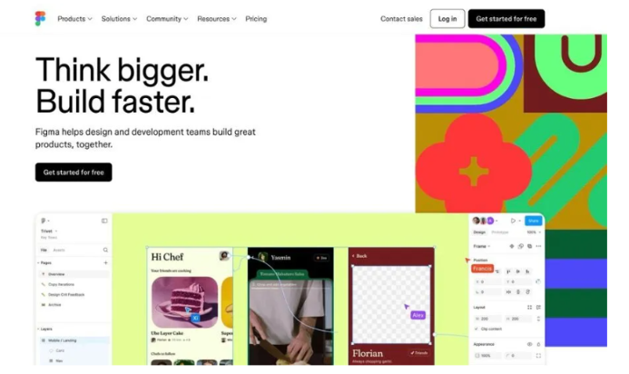
Source: FIgma
Whether you realize it or not, every color you choose will have a profound impact on how people feel when they visit your clients' websites. Just like grayscale colors can demonstrate sleekness and luxury, bright and bold colors can convey confidence, energy, excitement, and enthusiasm.
Gumroad uses bold, bright colors to make an emotional connection with their visitors. They want to make their brand feel lively and engaging, just like starting an online business should be.
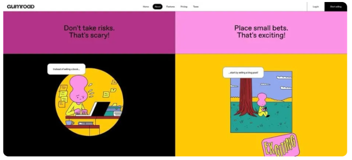
Source: Gumroad
Vibrant colors are also great for grabbing attention and making important elements stand out.
On Neil Patel's homepage, he uses white space to create a clean and minimalist design, but uses his classic bright orange branding to highlight the most important word (revenue) and the CTA button, to draw users' attention toward the free website analysis he's offering.
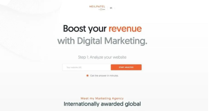
Source: Neil Patel
Best for: Brands with colorful branding, important UI elements, and a playful or energetic tone.
Final thoughts
While no one knows what the future holds for specific trends in web design, the key is to stay updated and informed about industry changes and user preferences. And most importantly, keep yourself in the know about new website technology, because the two things that'll never be off the trends list are accessibility and functionality. And there will always be new ways to improve both