🟢 Logo Design & Identity
A Visual Identity Designed to Distinguish, Not Just Decorate
We bring strategy, visual identity, and site architecture together from the start—so every element aligns seamlessly and your message comes through exactly as intended.
Professional logo design that defines your brand identity
Anyone can design a logo. Far fewer can tell you why one direction moves your business forward—and another misses the mark. That’s where the real difference lies.
What you need isn’t just design—it’s a visual identity grounded in strategy. Not fleeting trends. Not a designer’s personal showcase. A cohesive logo and identity system that clearly communicates what you do, who you serve, and what sets you apart—so the right people instantly get it.
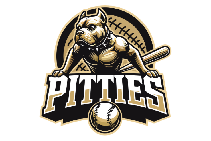
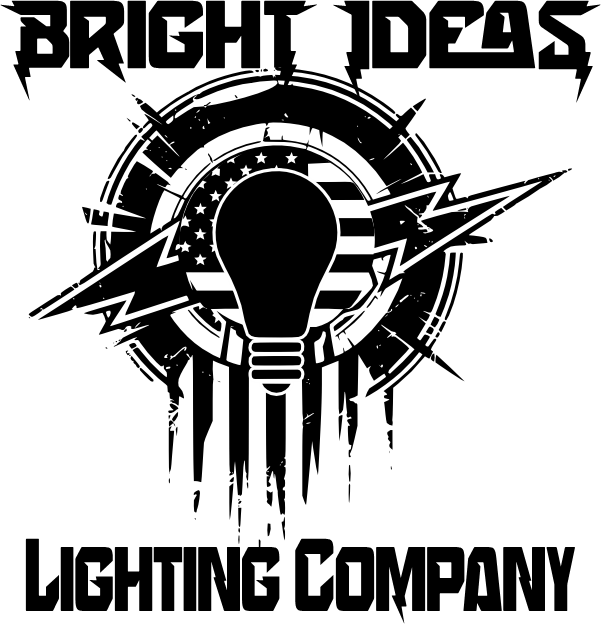
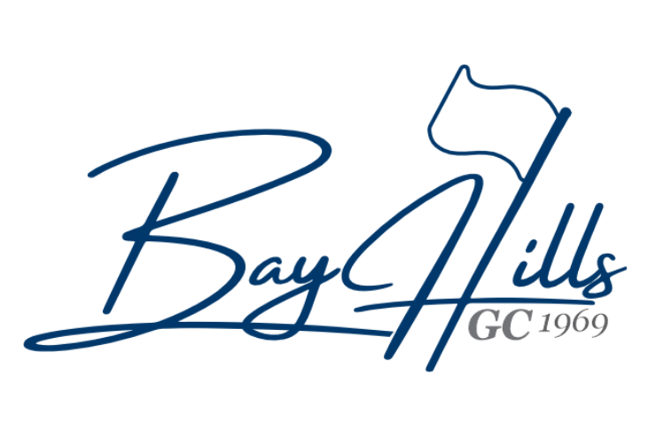
Logo Design Concepts


Our Approach
STRATEGY
Before a single line is drawn, we map the visual landscape of your category — the colors that saturate it, the typefaces that define it, the shapes and forms your competitors have already claimed. Then we look at where your logo actually has to live: on a screen, a label, a vehicle, a building. Every environment it enters, every size it must survive at.
All of that thinking gets crystallized into a strategic brief — not just what we'll make, but why this direction and not another. Why certain visual choices serve your positioning. Why others would undermine it. And the people who develop that strategy? They're the same people who see it through to the end.
DESIGN PROCESS
Phase 1: The Concept
Before a single color is chosen, you'll see the idea take shape. We present 2–3 distinct creative directions — each one a fully-realized point of view, rendered in black and white so the concept carries the weight, not the palette.
Phase 2: The Logo System
From the chosen direction, we build a mark that works everywhere. That means a primary logo, a horizontal lockup for headers and signatures, a vertical lockup for square formats — and where it makes sense, a standalone icon that holds its own without the wordmark.
We don't stop there. Every logo needs to survive the real world: reversed on dark backgrounds, stripped down for tiny sizes, and stacked when space gets tight. You get all of it.
Phase 3: The Full Identity
This is where the system comes alive. A strategic color palette — specified in RGB, CMYK, and Pantone — so your brand translates faithfully across screens, print, and production. Typography pairings that establish a clear visual hierarchy, from headlines to body copy. And supporting visual elements — patterns, textures, graphic devices — that give the brand room to breathe and flex across touchpoints.
Every decision is deliberate. Every element ties back to your positioning.
FILES & DOCUMENTATION
Everything you need, in every format. Vector files (AI, EPS, SVG, PDF) for infinite scalability, plus crisp raster exports (PNG, JPG) — all color modes covered, nothing missing. See the identity come alive through real-world application mockups that show exactly how it looks and feels in context.
A clean, no-guesswork usage guide walks you through minimum sizing, clear space rules, color specs, and clear do's and don'ts — so the brand always shows up right. And it's all yours. No licensing headaches, no restrictions. Full ownership and usage rights, period.