


Marketing to Humans: The 5 Ways to Get Personal in Your Digital Marketing

A practical look at where brands lose the human thread online, and how to get it back.

Somewhere between the funnel diagrams and the quarterly KPIs, most brands forget they're talking to people. A person reads a service page while deciding whether to trust you with their problem. A person clicks (or doesn't click) a call to action. A person opens an email between two other things they'd rather be doing. Every touchpoint in your digital marketing is a small human moment, yet so much of it still reads like it was written by a committee for an audience of none in particular. 


The good news is that getting personal isn't about a total rebrand or a bigger budget. It's about a handful of deliberate shifts across the places your audience already spends time with you. Here are five of the highest-leverage places to start.

1. BE MORE HUMAN ON YOUR SERVICE PAGES

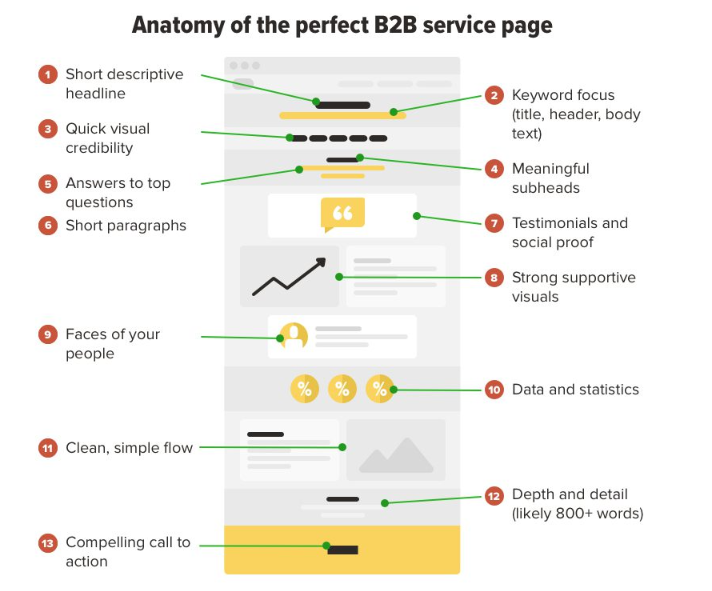
Service pages are where most companies default to jargon: "end-to-end solutions," "best-in-class capabilities," "leveraging synergies." None of that tells a visitor what actually changes for them. The fix is to write the page the way you'd explain the service to a smart friend: name the problem in their words, describe what working with you feels like, and show the outcome in plain language. Swap features for the specific relief or result a client gets. That single shift, from describing yourself to describing their problem, is usually enough to make a page feel like it was written for someone rather than at them.

Annotated infographic of a B2B service page layout with labeled content sections and visual callouts

2. BE MORE HUMAN IN YOUR CALLS TO ACTION

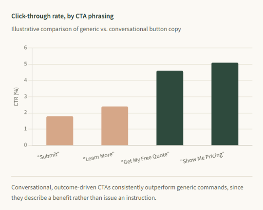
"Submit," "Learn More," and "Click Here" are calls to nothing in particular. They ask for an action without telling the person what happens next or why it's worth their click. A more human CTA speaks in first person, states the actual outcome, and matches the tone of the page around it: "Get my free quote," "Show me the pricing," "Yes, I want in." These small wording changes work because they close the gap between the reader's intent and the button in front of them, turning a generic prompt into a specific, low-risk next step.

Bar chart showing higher click-through rates for conversational CTA phrases versus generic buttons.

3. BE MORE HUMAN ON YOUR "ABOUT US" PAGE

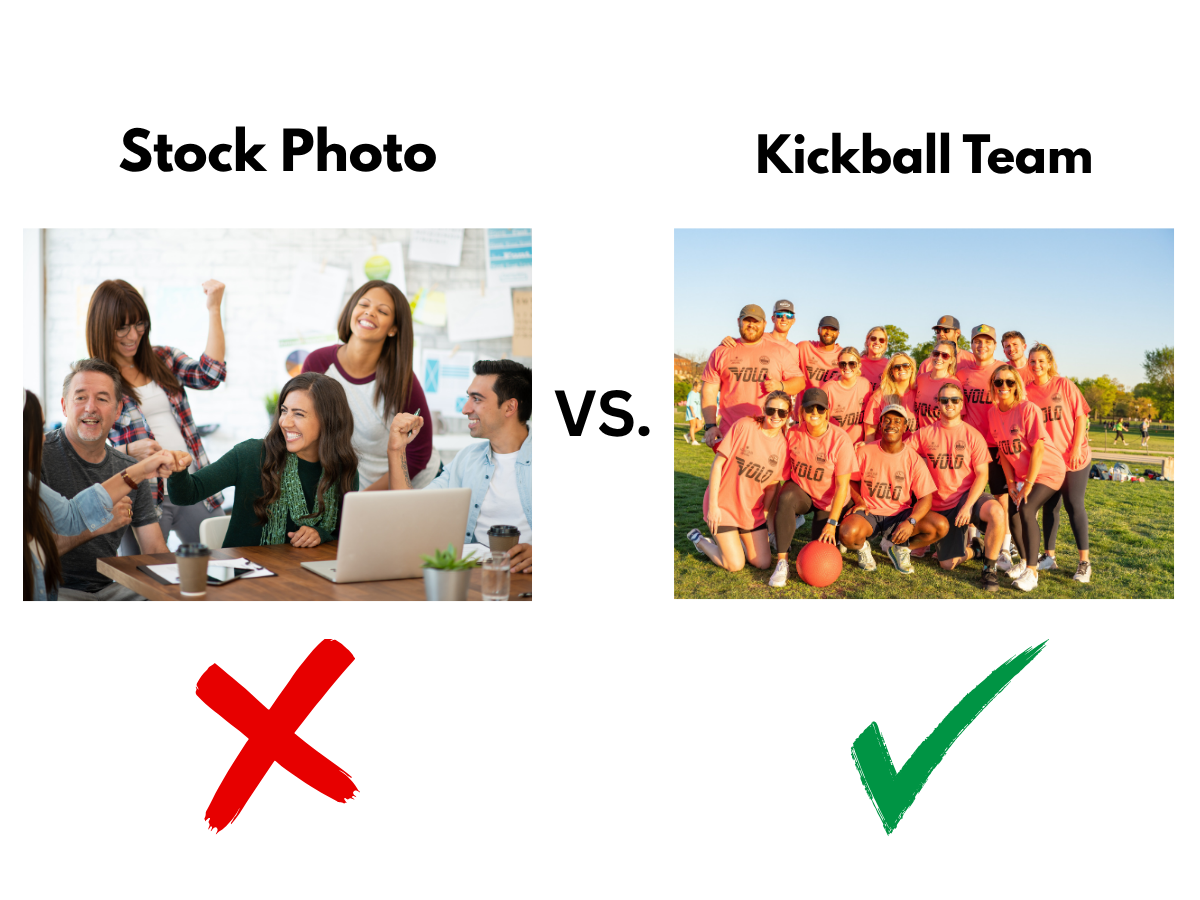
Most About pages read like a press release: founding dates, mission statements, a stock photo of a handshake. But this is the one page visitors go to specifically to find a person behind the brand. Tell the real story of why the company exists, introduce the actual people doing the work, and don't be afraid to mention the mess and doubt that came before the polish. A page that admits to a real founding struggle builds more trust than one that only lists accolades, because it reads as honest rather than curated.

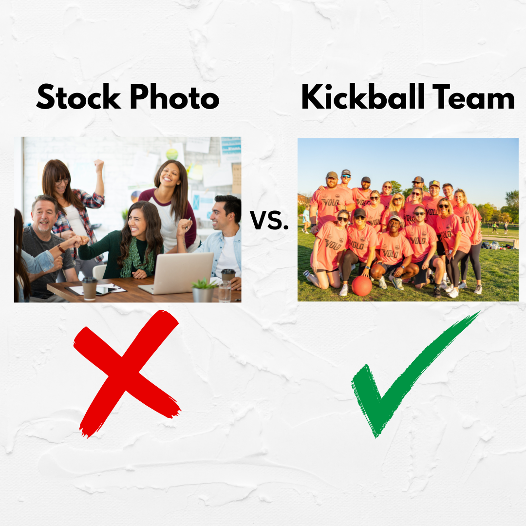
“Stock Photo” group of people around laptop marked red 'X' under it vs “Kickball Team” in orange uniforms with a green checkmark under it

4. BE MORE HUMAN IN YOUR SOCIAL CONTENT

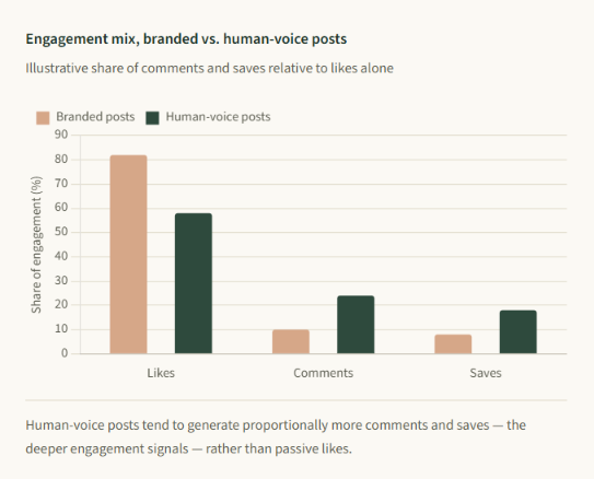
Social feeds punish anything that feels like an ad, and reward anything that feels like a person talking. That means trading polished announcement graphics for behind-the-scenes moments, replying to comments in your own voice instead of a canned macro, and being willing to show a little personality, even opinion, in your captions. The brands that build real communities aren't the ones posting the most; they're the ones that feel like someone is actually on the other end of the account.

Bar chart comparing engagement: human-voice posts get more likes, comments, and saves than branded posts.

5. BE MORE HUMAN IN YOUR EMAIL MARKETING

Inboxes are crowded, and most of what lands there announces itself as marketing before the subscriber even opens it. Personalization is more than inserting a first name; it's segmenting by real behavior, writing subject lines the way you'd text a colleague, and letting emails come from an actual person's name rather than "The Team." A newsletter that reads like a short note from someone who knows the reader's situation gets opened, replied to, and trusted, long after a blast campaign gets archived unread.

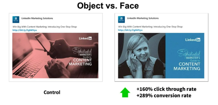
Object vs. face ad comparison: red control card and blue portrait card with higher click-through and conversion rates

None of these five shifts require new tools or bigger budgets, only a willingness to write, design, and respond like the people on the other end are, in fact, people. Start with the page or channel where you hear from customers the most, make it sound like a person wrote it, and let the rest follow.

Share this article

Recent Posts

OpenAI logo beside glowing blue “AI” letters on a dark circuit-board background and ChatGPT 3D logo
By QuickPro Mobile August 27, 2026
OpenAI is testing ads in ChatGPT for free and "Go" tier users in the US as of February 9, 2026, aimed at supporting infrastructure costs. These ads will be clearly labeled, appear at the bottom of conversations, and will not affect the accuracy or neutrality of AI responses.

Web developer points at code on a large monitor during a client meeting in a glass-walled office
By QuickPro Mobile August 19, 2026
QuickPro Mobile dig into the exact language your customers use — the real, specific questions behind their searches — and turn those insights into strategic, well-structured website content. The result: your business doesn't just appear in search result it answers the questions your customers are already asking

Blurred close-up of the word “Design” in white and gold on a dark surface.
By QuickPro Mobile June 17, 2026
n 2026, a website redesign isn’t just about looking good—it’s about staying ahead of your competitors. A fresh, modern site can boost performance, enhance user experience, and leverage the latest tech trends, from AI-powered features to cutting-edge design.

Keyboard with optimization button in orange with rocket icon
By QuickPro Mobile April 24, 2026
At QuickPro Mobile, we guide businesses through this transformation with Answer Engine Optimization (AEO)—a forward-thinking strategy designed to position your content where it matters most: directly in front of users seeking clear, immediate answers.
Close-up of a person’s eye with a colorful Google icon reflection in the pupils
By QuickPro Mobile April 1, 2026
If your business serves customers in person, a Google Business Profile (GBP) isn’t just nice to have—it’s essential. A well-optimized GBP boosts your visibility on Google Search and Google Maps, improves your chances of showing up at the top of local results, and gives you full control over how your business appears on

Abstract motion-blur city street with bright light streaks and a person walking
By QuickPro Mobile February 13, 2026
Questions about optimizing mobile page speed are common in the web design world. To address these, we turned to Russ Jeffery, Director of Platform Strategy at Duda and one of our experts on the matter.
Comparison: a stock photo of a business team vs. a kickball team; the kickball team has a green chec
By QuickPro Mobile December 29, 2025
Whether you’re a small business, a local player, or a global enterprise, one truth applies to all of us: Our audience is made up of people. And people come with natural biases and instincts. One of the strongest is the need to connect. We seek relationships. We’re wired to be social.

Glowing light bulb with a warm yellow light against a dark, smoky background
By QuickPro Mobile November 18, 2025
Google's mobile-first indexing requirements mean search engine crawlers will prioritize the mobile version of your website content, rather than the desktop version. And, in January 2024, mobile site visits (excluding tablets) accounted for more than 60% of all web traffic.